|
Have you ever visited a website that was chock full of information, yet void of visual stimulation beyond the reading process? Well sometimes, the perfect pairing for that informative web pages is a video that can show web surfers exactly what you are talking about.  Talking sites are nothing new, but this article shows how video can . . .
Below is a prime example of how a clean design can help get your message across by removing the things that don't matter and emphasizing those that do. This client's site was matched to their company colors for a cohesive and consistent look, with all buttons complementing the special green accent color of their logo. This was accomplished simply by sticking with the 3 primary colors of Black, Green and White to keep the site from looking too "busy". 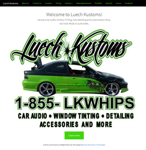 This site was coded by hand to be fast and also utilizes bootstrap in order to create a fluid user experience when viewing on mobile or tablet devices. The responsive design becomes apparent as you resize the page on a desktop screen or view it on a smaller device. You will notice that the full navigation menu up top is replaced by an accordion view in the top right corner that allows you full menu functionality . . .
|
AuthorDamon M. Brooks, Sr.is an IT Professional with close to 25 years experience within a wide range of industries. ArchivesCategories |
 RSS Feed